
5 reasons to fix your “mostly sorta OK-ish” credit union website
If your credit union’s website is a real dumpster fire, then the reasons to upgrade ASAP and pronto are pretty obvious.
But what if it’s just… a little lame? Sorta… meh. Just, you know, not awful, but not great. What’s your motivation if it’s not TOO painful?
Here’s why now is exactly the right time to get started on a next-level website before it’s too late.
Your first impression isn’t impressive.
Even if it’s sorta OK, your snoozefest of a website is damaging your brand and costing you new members. That’s because every single one of your potential new members is doing their due diligence before you even know they exist. They’re Googling you and poking around your website to see what you’re like.
Does it feel like 2030 or 2010 in there? Your first point of contact for most new members is your website. Make sure you’re dressed to impress.
Just look at all this clutter
Hey, we understand. Stuff happens, and over time, cruft and clutter accumulate. The VP of lending wants this on the home page, the CEO wants that in the navigation, the Board wants even more stuff at the top of every page, it never stops. Before you know it the navigation is stuffed with hundreds of links, no one can find anything, and a couple dozen promos are competing for attention on the home page.
Less is more. Focus on one message on your home page. Get rid of the nonessentials. Clear out everything but the top five or six things members and prospective members need to find and know. Revamp, clear out the noise, and build a clean, clear website that communicates.
Ch-ch-ch-changes are p-p-p-painful
Can you plop in an image gallery or add a video with just a few clicks? If you’re stuck with simple stuff, you’re stuck in the past. If everyday stuff like updating a rate, adding a new page, adding a link to the navigation, or creating a new blog post takes more effort than firing off an email, you’re long past due to make a change to a better content management system (CMS).
Sure, it’s the “back end”, but your CMS matters a lot to the “front end”, too; when the CMS is a pain, website content gets neglected and clutter builds fast.
FYI: We build CU websites with the biggest and best, WordPress, which powers about 40% of the internet, and has endless options and capabilities.
Futureproofing Fails
Lots of things have changed in the last few years – ADA/Accessibility concerns are top-of-mind, and mobile won long ago. Member self-service, data-driven marketing, personalization, analytics and more have revolutionized life online.
And who knows what will be next; if aliens land next month and need flying saucer loans, how fast can you adapt your website to be tentacle-friendly so it works on their underwater screens?
An updated website has to be built from the start for agility, flexibility, and constant, fast-paced adaptation and experimentation. If your platform can’t keep up, it’s time to upgrade.
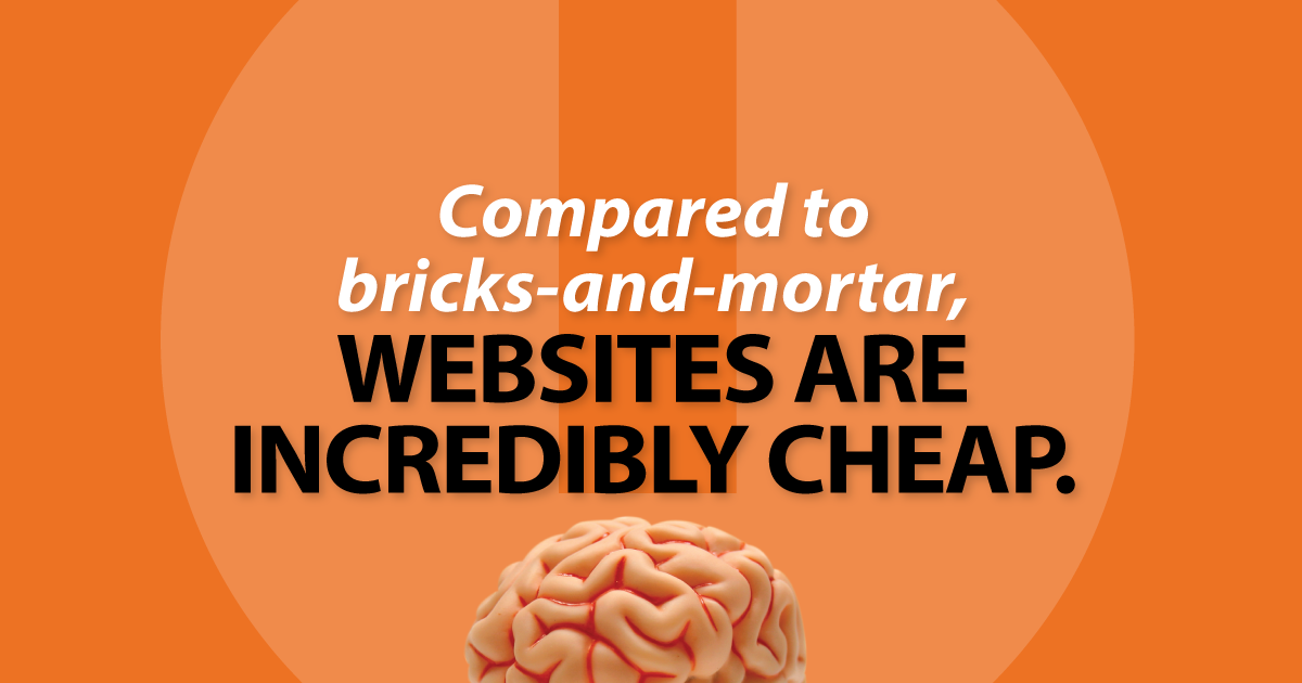
Websites are screaming purple-polka-dot-zonker bargains
Compared to bricks-and-mortar, websites are incredible bargains. For less than the cost of a new branch bathroom, you can build a shiny new 24/7/365 internet outpost that every single member and prospective member will see and love.
Thinking about updating your website? Be sure to download these free resources to help you get the website you’ve always wanted. Our customizable Better Website Checklist of necessities and “nice-to-haves” will keep you from missing anything critical, and help you plan and manage your website project efficiently. Then use our customizable Better Website RFP to ask the most important questions, then compare responses to your Better Website Checklist. Not to mention our Better Website Redesign book is filled with practical advice on building credit union websites. All available here, all free.
- Building better offsite warnings for CU websites - June 30, 2026
- When it’s time to DIY and when it’s time to call a pro - June 23, 2026
- Will it blend? The only CU fintech question that matters. - June 16, 2026