
What will your next website look like?
Several trends in website design are drastically shaping how sites are experienced by users. It’s no wonder why so many Credit Unions are updating their sites – even those that are only 2-3 years old.
And if yours is older than 5, well, you probably already know how out-of-date it feels.
What IS the fashionable website wearing these days?
Or, for those that don’t care to be “trendy”: what do I need to improve in order to keep my site relevant to my members?
Start with the basics:
Make sure you are in control.
You’ll want a Content Management System that allows you to add new capabilities in the future, and edit content to any part of your site at any time. Plus your site needs to be built using Responsive Design so that it will adapt to any size screen. These two items are must-haves for any site redesign.
Use a Mobile-first strategy.
Since 2015, mobile has overtaken desktop as the primary method of web access. Sure, people spend a lot of time in apps, but those are mostly social apps, not banking (besides, even if you get 20% of your members to download your app, maybe half of those will actually use it). But the growth in mobile means that your efforts will be better spent making sure your site is designed well for mobile users, before you worry about how it looks on a desktop.
From this point on, you have plenty of options to consider:
Simpler layout and navigation.
We’ve seen a growing interest in simplifying navigation and organizing user interface to the most important elements. Tucking home banking logins into a sidebar element can open up more marketing space.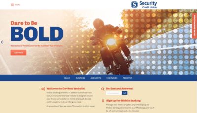
Richer colors and bolder typography.
Look for vibrant color palettes and type that makes a brand statement.
Duotones and illustrations.
Duotone photos are becoming a much-needed replacement for standard stock photos, and illustrations can be a unique way for your brand to stand out.
Long-scroll navigation.
For years, websites have tried to break content into multiple pages with specific information. Now with the rise in mobile, pages are increasingly becoming longer, as users can quickly scan content with a single motion.
Parallax design.
Background and foreground sections scroll at different speeds using parallax design, creating an illusion of depth and adding additional visual interest.
Micro-interactions.
Subtle animations that give instant feedback or a visual reward so that users can tell something is happening. Can also be used to add call-to-action prompts when used with buttons.
Video.
Eye-catching and dynamic, video is quickly taking over online. If you have the capabilities to create video, especially something appropriate such as explainer videos, this is a great way to boost usage. Google also likes video in its rankings.
- Rebranding: why it’s all about your “why” - January 20, 2026
- Why your CU really needs an intranet - February 19, 2025
- Are you scared yet? - October 22, 2024