
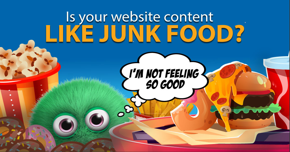
The Top 5 Content Problems on Credit Union Websites
Content is the beast that you never stop feeding. It’s the mill that always requires more grist. Like washing your dishes or doing the laundry, you’re never actually done-done. And that’s what makes it a headache for every marketer who has more responsibilities than time.
Not all content is created equal, however. The social media posts you draft and blog articles you write are fun and flashy, but they rarely stick around for very long. As long as you’re following a well-thought-out strategy, you can more or less write, post and forget about these.
Your website content is a bit… stickier. It’s not as permanent as print, but it’s also not the type of content where you want to make big changes frequently. That’s why it’s important to get content that enhances your website, instead of just filling space.
Here are the top 5 content problems on credit union websites.
Omitting the Basics
What’s your routing number? Where the heck are you? How do I contact you? All of these things could reasonably be on every single page of your website. To be fair, you will still get people who can’t find these answers, but at least there will be fewer.
I know I’m not representative of a “normal” person by now, largely due to how many CU websites I’ve reviewed. But that’s also kind of the point– if I can’t find the answers to those questions, very few “normal” people can.
Learn nothing About Us
Back in nineteen-something-something a group of normal folks got together and put their money in a cigar box and now we’re a credit union that wants to keep our members’ wallets healthy.
Yes, we know. And for the record, it’s definitely worth including a blurb about the credit union’s origins somewhere on your About Us page. But it doesn’t have to read like a middle school history book.
The first paragraph or two of your About Us page is your chance to show potential new members what sets your credit union apart from other financial institutions. Saying, “we’re a credit union and we help people save money” does not exactly make you stand out. Pack this section with as much local flavor and human interest as possible, because your average person doesn’t have a frame of reference for your asset size.
“Numbers? We’ve got the best numbers*”
*= You are not entitled to these exact numbers
Speaking of no frame of reference, let’s take a moment to remember how “normal” people understand rates. Ready? The average person does not understand rates.
I’m obviously not including the rate-shoppers in this statement, or dad or uncle who has a spreadsheet detailing the depreciation of all of his assets since 1974. Those are the people who have bookmarked your rates page.
Most everyone else won’t understand a rate when they see it without context. They’re just seeing a number and that information doesn’t penetrate their information-overloaded brain. And if they do pay attention, they’ll see the disclaimer and they’ll think the number is just a suggestion. So maybe don’t slap a bunch of headline-size rates across the home page of your website.
Again, I’m not saying don’t do it at all. After all, rate-shopping gives all those dads and uncles something to do.
Financial Ed Filler
Financial education content can be admittedly tricky. Include any numbers in your content and it’s outdated in the blink of an eye. Plus there’s the issue with targeting your audience. On an individual level, you can’t provide relevant financial education to everyone. I mean, how can you, when we’ve experienced several once-in-a-lifetime economic events in just the past 20 years?
Unfortunately a lot of the “canned” financial education content out there misses the whole target, not to mention the bullseye. It can be so generic that the only takeaway becomes “save money by not spending money.”
That’s why it pays to take the time to identify your real audience. For credit unions that means members, so you need to start brainstorming ways to get a bead on the financial issues that your members are facing. Talk to your tellers, send out surveys, post polls on social media, whatever seems doable. Figure out the questions your members are asking before you try to answer them.
FRAUD FRAUD FRAUD
I completely understand why this happens. Scams and fraud seem to be everywhere, and it probably feels like your members are either a. scared of fraud or b. actively being defrauded exactly at this moment. You need to warn people about different types of scams and fraud, what to do if they become victims, and how to avoid it in the future. It’s exhausting.
Unfortunately, a big flashing banner on your website only serves to heighten the tension. When a member visits your website and sees a giant warning notice, it’s going to feel like the credit union is saying “you’re not safe here!” which is obviously the opposite of what you’re hoping for.
In most cases you’ll be better off making a Fraud Center page where you can lay out all of the details calmly. Leave the link visible on your home page, but maybe ditch the panic-button red and flashing animation.
All Content Needs an Audience
The common thread is that your website content needs to be purposeful and have an audience. You should be able to answer the question, “who is this for?” and if the content fails that very basic test, you’ll know what you need to work on next.
Once you’re clear about your audience, check your analytics. Even great website content doesn’t help much if no one is visiting that page.

- 4 ways to help your members fight fraud-phobia - March 25, 2026
- How do you get new members to Google you? - March 2, 2026
- Top 5 things that might be missing from your website - February 11, 2026