
Quick check: five simple things that must be on your home page
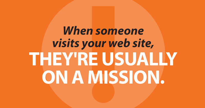
When someone visits your web site, they’re usually on a mission. No one visits a credit union web site for entertainment or to shop for shoes — they’re looking to get something done. Take a quick look at your web site right now and make sure visitors can find what they need instantly.
1. Your home banking login
I’m just here for the home banking, thanks. 75% to 90% of visits to your CU’s web site are simply members logging in to home banking. Make this as painless as possible with a nice big shiny button or form. Make sure there’s not a lot of clutter around this area, and that any other forms on the page aren’t causing confusion.
2. What’s cooking?
Any specials right now? What do I need to know? Think in terms of a billboard on the highway — you’ve got maybe three seconds to get a message across until the member drives past at 75mph on the way to home banking — that’s seven words at most. Quick, what’s that message? Is it coming through loud and clear?
3. Link to hours and locations
I need to interact in person with a real live human being! Are you open? Will you be open when I can get there? Where are you? If you don’t use a dedicated mapping service, include Google maps or links to Google maps for directions. (Bonus: include your city or cities and state on every page — people often just Google the name of your CU to find your site, and this helps eliminate potential confusion quickly. It also makes it much easier for potential members to find you.)
4. Phone number and email
I need to communicate with a real live human! Make sure your phone number is on every page. Consider an email address as well, but ONLY if it will be routed correctly and answered promptly by a real live human. These can be at the bottom, but it’s well worth placing a phone number higher up on the home page.
5. Link to current rates
Next to the home page, rates pages consistently get the most traffic on credit union web sites. Make sure these are easy to find for the rate shoppers.
Bonus item: Text
Too many CU home pages feature nothing but images, some of them blinking and dancing. Don’t forget to put in some actual text content. Google can’t index pictures, and savvy web users have learned to automatically ignore any image that looks like it might be an ad. Besides, it’s important for ADA compliance/accessibility.
- Mapping member minds for better CU website navigation - July 22, 2026
- Building better offsite warnings for CU websites - June 30, 2026
- When it’s time to DIY and when it’s time to call a pro - June 23, 2026