
Big Brand Updates: Fix or Fail?
Most brand updates happen for a reason. Something has changed that needs to be fixed for the brand to grow in the future.
Recently, several major companies have updated their brands, and of course everyone had an opinion. Some were applauded, while others were panned. Some were a strong Fix, while others were a surprising Fail.
Which is a bit intimidating, especially if you are considering a brand update soon for your credit union, organization or company. But everyone can learn a few lessons from their results, no matter how big they are.
General Motors plugs in
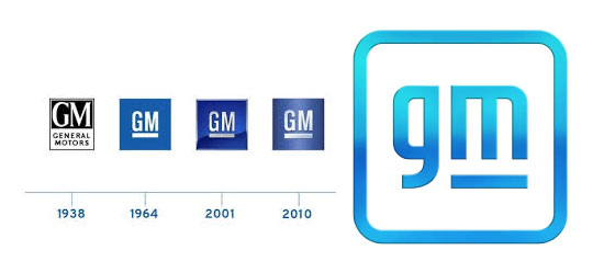
GM’s logo had to be one of the most boring logos ever. And it has been around for, like, forever. Okay, since 1938, with one major update in 1964 and minor tweaks a couple of times since.
It was due.
Especially since GM has been touting how focused they are on an All-Electric Future. GM has even partnered with Honda and Cruise to develop a self-driving electric car without a steering wheel or pedals.
Thus, their new brand was supposed to demonstrate their commitment to that idea.
And it does. Kind of.
If you squint a little bit and let your imagination go through some contortions, you just might start to see the downstrokes of the lower case “m” as the prongs of an electric plug.*
Of course some critics panned the new logo design right away. (That’s in their job title, so of course they did.) But they do have a point. And it’s not just the design critics sounding off. Some people see an elephant in the new logo (the descender of the “g” is its trunk). One person tipped it 90 degrees counterclockwise and read it as El (for electric) over a gas pump handle. Or was that “El-on” – perhaps a nod to the newly-minted Richest Man on Earth? Apparently everyone’s a critic online.
But for logos that need a clear “heritage” connection, this is a pretty good effort to honor that history. Besides, getting a huge corporation to make a branding change like this is no small feat. The design firm and marketing staff should be congratulated for that accomplishment alone. (But I think the blue gradations will likely start to look dated rather quickly. The marketing staff should allow those to quietly disappear.)
Rating: FIX (mostly).
*Somehow I doubt that GM’s Board of Directors would have let the designers take it even further like I did at right. But if somebody at GM likes my idea for the next version, give me a call. 😉
Burger King goes backwards
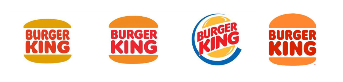
It took Burger King fifteen years after their start to come up with the bun logo with their name in the middle. 25 years later, their only tweak was to make the bun bigger and the font a little easier to read.
But for some odd reason 5 years after that, they decided they needed a shiny, cheesy, angled, “swooshy” logo. Not sure where that came from, unless it had some connection with that creepy plastic head used in their advertising?
At least when they just recently flipped it back to their retro logo they gave it an even fluffier top bun. No wonder people called them out for doing the time warp dance.
And while I think the new/old look is better than “shiny, cheesy, angled, swooshy”, I still have to question their new/old font choice. Especially when you see it used in the rest of their branding materials. It all feels a bit-too-vintage-60’s-grooviness to last very long.
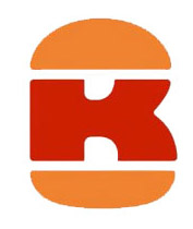
And what was wrong with the B+K monogram that popped up in the promo video? Maybe that should actually be the logo. At least it would look a little newer, while paying homage to their past.
While I have to give them credit for finally getting rid of a really bad logo, I think they missed an opportunity to actually do something to advance the BK brand. Instead of repositioning Burger King to attract new customers in a future where fast food restaurants are disappearing, they simply retreated back into a 50 year-old memory.
Rating: FAIL.
Pfizer spins off
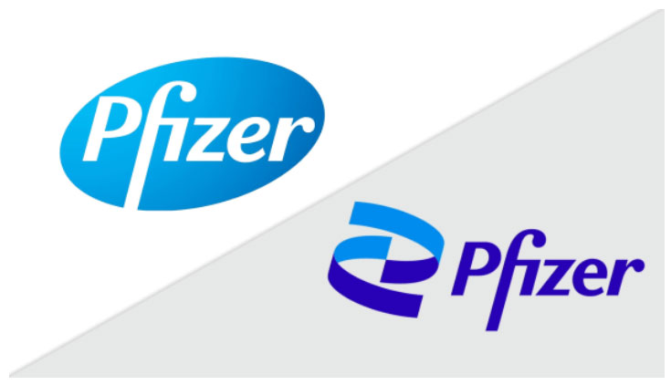
Not every company’s name is so connected to a shape and color like Pfizer. But as they spun off a lot of their well-known products (the little blue pill aka Viagra, Advil, ChapStick), Pfizer started looking at a rebrand. They wanted to reflect their new image more as a science-based company rather than consumer products company.
Then suddenly, almost two years (!) of focus groups and branding work had to be put on hold to focus on a COVID-19 vaccine. But, once the vaccine was accepted, Pfizer was able to capitalize on their vaccine publicity to roll out their new brand as well.
They kept the basic look of their font, which helps with brand recognition, along with a similar blue color that is paired with a darker violet that gives it a much stronger feel overall. Although the double helix DNA has become almost a cliche in biotech logos, Pfizer partially avoids this by using an abstract, simplified version.
Companies that shift directions need brands that reflect that shift. Especially if they want to encourage further investment by potential stockholders.
With the successful launch of the first COVID-19 vaccine, Pfizer couldn’t have asked for better timing to roll out a new brand, and to capitalize on their hard work. Their website brand pages, while predictably corporate, do a good job of explaining their new focus to the investors they are trying to reach.
Even better, their logo no longer reminds anyone of that little blue pill.
Rating: FIX.
Brand updates should always be a Fix. Never a Fail.
Rebranding is not an easy thing to do, and should not be taken lightly. There is always historical equity to be considered, on top of the personal, emotional connections with the current brand. Especially when you are dealing with people that were part of building that past.
All of which can add a lot of inertia to push through in order to do what needs to be done.
But when there are reasons to rebrand, you need make sure everyone is aware of those reasons. By bringing in experts to help start those necessary conversations, you get the chance to build a consensus on where you want to be in the future.
And that’s when you can turn inertia into momentum.
- Rebranding: why it’s all about your “why” - January 20, 2026
- Why your CU really needs an intranet - February 19, 2025
- Are you scared yet? - October 22, 2024