
Web Accessibility: Fixing Contrast Conundrums
One of the more common website accessibility/ADA issues we see is contrast — when there’s not enough contrast between type and the background color, people with certain visual problems might have trouble reading the text.
Fixing the problem is pretty straightforward from a technical standpoint, but it can lead to some tough decisions about brand standards.
Who does this affect?
People with many types of visual acuity problems can have trouble seeing low-contrast text. However, people with various forms of color perception problems can also have trouble that’s a little more difficult to anticipate.
To address this, the web accessibility standards organizations have settled on certain color contrast ratios that should allow most people to easily use websites while still offering a wide variety of colors. The WCAG 2.0 AA standards call for a 4.5 : 1 contrast ratio between type and its background for smaller type, while larger type (18 point bold and larger) can use 3 : 1. (The WCAG 2.0 AAA standards are even more strict, calling for ratios of 7 : 1 for small type and 4.5 : 1 for large bold type.)
How do we tell if there’s a problem?
The WAVE tool from WebAIM does a pretty good job of sniffing out contrast problems (and many other potential accessibility issues as well) — just punch in your web site address here: http://wave.webaim.org/
To see contrast errors, click the “Contrast” button just under the WAVE logo, and click the flags to see an explanation. You can even experiment a little with making colors darker or lighter.
For example, on this white background:
- Type this color has a contrast ratio of 2.9 : 1 — a little too low.
- Type this color has a contrast ratio of 3.55 : 1 — OK for large bold type, but not for small type.
- Type this color has a contrast ratio of 4.76 :1 — OK for any size type.
How do we fix it?
You’ll need to work with your site developers and designers to update your site’s CSS (stylesheets) to use new higher-contrast colors. You may also need to update any images used as backgrounds, and remove or replace images containing text. You may also need to make type, especially headlines, a little larger. Don’t forget to look at link and mouseover colors, too.
If you’ve used local HTML or inline CSS to style text, you’ll need to remove it (its best to rely on your site’s global styling, and avoid using local styling), or change the colors wherever they appear.
What about all our cool groovy pastel brand colors? We worked soooo hard…
Some websites already use high-contrast colors and don’t need much alteration, but if your brand depends on lighter colors, you may need to make some painful decisions. Changing background and text colors requires a sensitive balancing act between your brand standards and accessibility, so you’ll need to work with designers and developers who understand your brand. There are many different possible solutions to every situation.
For example, if your brand look is based on pastels or bright, sunny colors, you might need to stop using white type against a light background, or add darker accent colors to your palette. If you find that making the text darker makes your site’s overall visual brand a little gloomy, you might balance this by using lighter backgrounds, increasing line spacing, or using different fonts.
If you’re using type over images, you may need to add a translucent or solid box to ensure there’s always enough contrast. Once you have a set of colors that works well, make sure you update your written brand standards to include the hex color codes.
We need a slightly darker orange and a lighter green. How can we start figuring this out?
There are some great online tools that let you experiment with colors and discover color combinations.
- http://colorsafe.co/ – punch in a color code, and this tool generates colors with sufficient contrast.
- http://leaverou.github.io/contrast-ratio/ – this site lets you experiment with different colors of text and backgrounds, and shows you the contrast ratios
- http://www.colorhexa.com/ – punch in a color code, and this site will generate tons of alternates, shades, tints, possible color schemes, and even charts of how the color might appear to people with certain types of color blindness. It’s a great way to experiment with web colors.
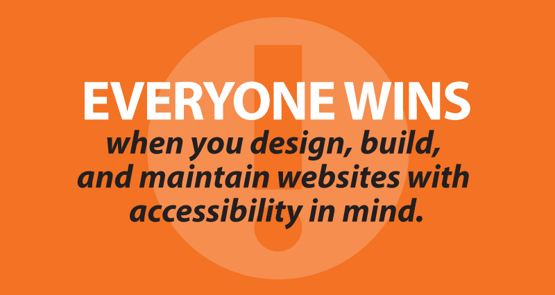
In the end, higher-contrast type is easier for everyone to notice and read, not just people with visual problems. Everyone wins when you design, build, and maintain websites with accessibility in mind.
- Mapping member minds for better CU website navigation - July 22, 2026
- Building better offsite warnings for CU websites - June 30, 2026
- When it’s time to DIY and when it’s time to call a pro - June 23, 2026