
Think screenspace, not meatspace
For most credit unions, each member drops by your website an average at least four or five times a month. It’s open 24/7/365, and you can do things with color, interaction, and motion on a screen you just can’t do with a postcard or in a branch. Add in mobile app usage, and, well, you can see why “meatspace” (you know, the real physical world) is becoming less important than “screenspace”.
Your website is the most visible outpost of your credit union.
Your credit union’s website should be the starting point and the hub of your brand, your marketing, and your entire member experience. How do you make sure that happens?
Put online first in line
The entire member experience must be actively and thoughtfully crafted – don’t leave it to chance. Put online first in line, with everything else flowing from there; online is where you have the greatest flexibility and impact, along with the ability to experiment, fine-tune, evolve, and revolutionize.
Interoperability: not just an eight syllable word
Make sure everything works, and everything works together. For example, your online banking login should look like it belongs, and when members log in, they shouldn’t feel like they ended up somewhere else. You want a fast, smooth, and seamless experience on all devices.
The same goes for your email, social media, chat, MCIF or CRM, and offline media. The goal is a consistent, on-brand member experience, no matter what.
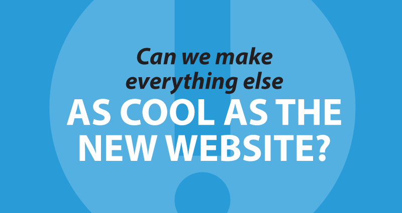
Make everything awesome
Of course, “meatspace” is still pretty important. When we build credit union websites, we’ve found that the site design process often kicks off a brand review of just about everything else — “can we make everything else as cool as the new website?” Extend that fresh “screenspace” thinking into every other part of the credit union.
- Building better offsite warnings for CU websites - June 30, 2026
- When it’s time to DIY and when it’s time to call a pro - June 23, 2026
- Will it blend? The only CU fintech question that matters. - June 16, 2026