
Why do so many CU websites look like garage sales?
Advertising banners squeezed in everywhere, blinking, flashing, rotating, and screaming for attention. Dire warnings about phishing and hacking appear but never seem to go away. Hundreds of words crammed into every banner and every available space. An urgent notice about last year’s annual meeting.
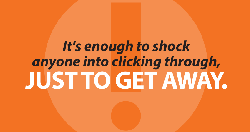
It’s enough to shock anyone into clicking through to home banking as fast as possible, just to get away.
How do we get rid of all the junk that piles up?
1. Treat your home page as if it were an outdoor board.
Most of your visitors will only spend a few seconds on your home page, so present the viewer only with the most important information in clear, bite-size chunks. The old rule of thumb with billboards is that you’ve got about three seconds and seven words before the reader glances away and drives past, and it’s much the same with web sites. For example, you could change the layout to a sectioned, vertical homepage that presents one clear message at a time. Think one image per section, with just a few words. Your navigation won’t disappear, and there will still be a way for someone to click to your rates or loan page. But your campaign ROI and your brand messaging will improve dramatically when people can see a clear message instead of mess.
2. Incorporate promotions as content, not ads.
When you place your promos in blocky, blinking shapes along the outer margins they scream LOOK AT THIS AD HERE!! IT’S BRIGHT AND COLORFUL AND WE WANT YOU TO PAY ATTENTION TO IT!!! Unfortunately no one does. In fact, internet users quickly learn to ignore rectangular objects, especially if they move. Turn that screaming, unloved banner image into an intriguing text headline and useful text content. (And don’t forget, search engines can only read text — they can’t read images.)
3. It’s less about how it looks on your monitor, it’s how it looks and works on your phone.
Mobile is quickly replacing the desktop for usage supremacy. That’s why most programmers are building for mobile. Don’t believe me? Ask the people who make most of the world’s networking hardware. According to Cisco, “mobile data traffic will increase 11-fold between 2013 and 2018…three times faster than fixed IP traffic.” So if you aren’t thinking mobile-first and planning your next site using responsive design, you will be even further behind very soon.
4. People actually prefer long, not wide.
See point #3. People have gotten used to scrolling with their thumbs, which is way easier than zooming in and target shooting links. When planning your responsive design for mobile, stack the content, make the graphics bold, the wording short, and the buttons big and finger-friendly.
- Rebranding: why it’s all about your “why” - January 20, 2026
- Why your CU really needs an intranet - February 19, 2025
- Are you scared yet? - October 22, 2024